Choose Outdoors
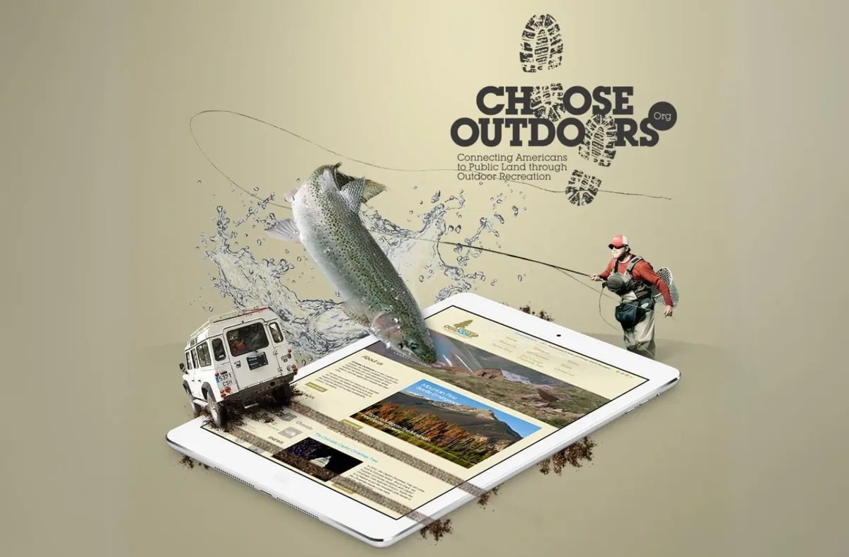
A brand identity and website for a nonprofit getting more people outside.
The context
Get more people outside.
Choose Outdoors champions access to public lands and outdoor recreation, connecting people with the places and programs that get them outside. A cause that lives outdoors still has to work online, where most people first decide whether to get involved.
The organization needed an identity and website that felt as welcoming and grounded as the outdoors it advocates for.
The work
An identity built to invite.
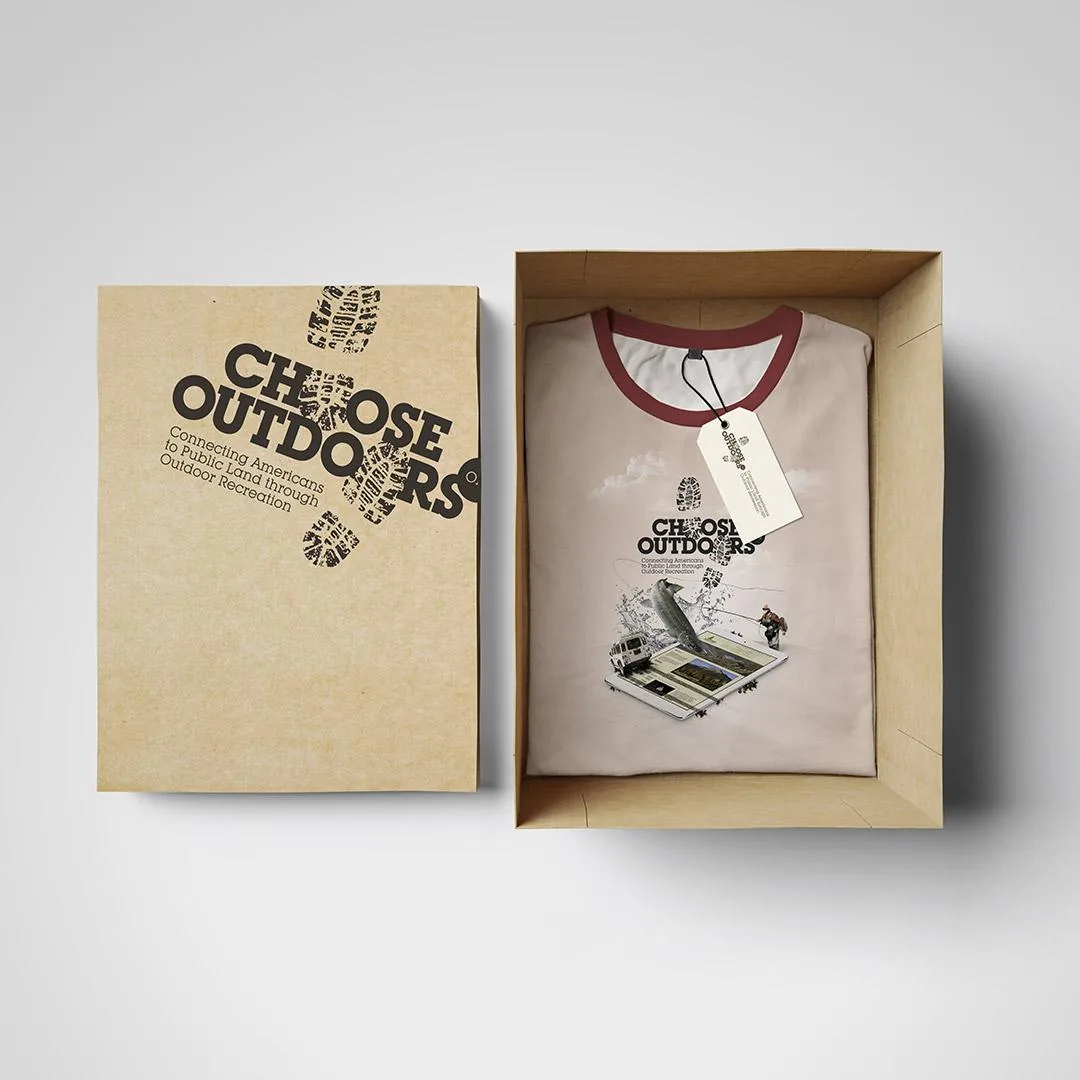
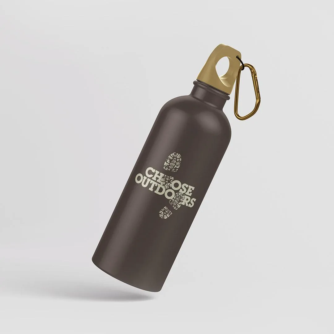
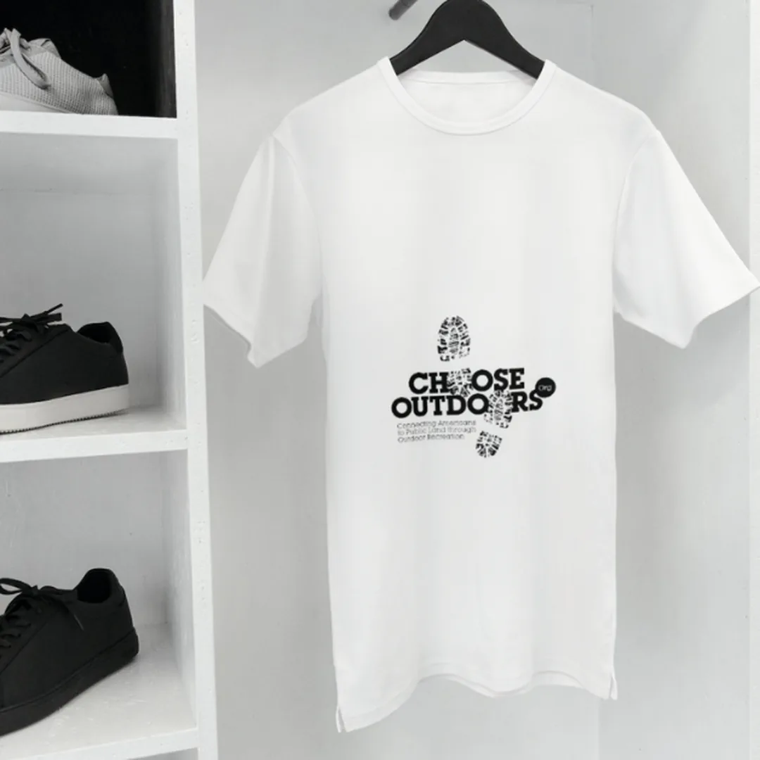
The name is the idea, so the mark says it without a symbol beside it: the O in CH-O-OSE and the O in OUTDO-O-RS are replaced by a boot print, and a second print steps out below. Read the logo and you have already walked somewhere. Heavy slab caps hold it together so it stays legible stamped on a shirt or shrunk into a favicon.
It shipped as a working system, not a picture: construction grid with clear space, a palette of three (a trail brown, black and white) documented in CMYK, RGB and HEX so print and screen never drift, favicon crops tested at 110, 56 and 32 pixels, and the type specimens in both weights. Then the identity was carried out into the campaign pieces and the website.
The mark
Two boot prints and a wordmark.
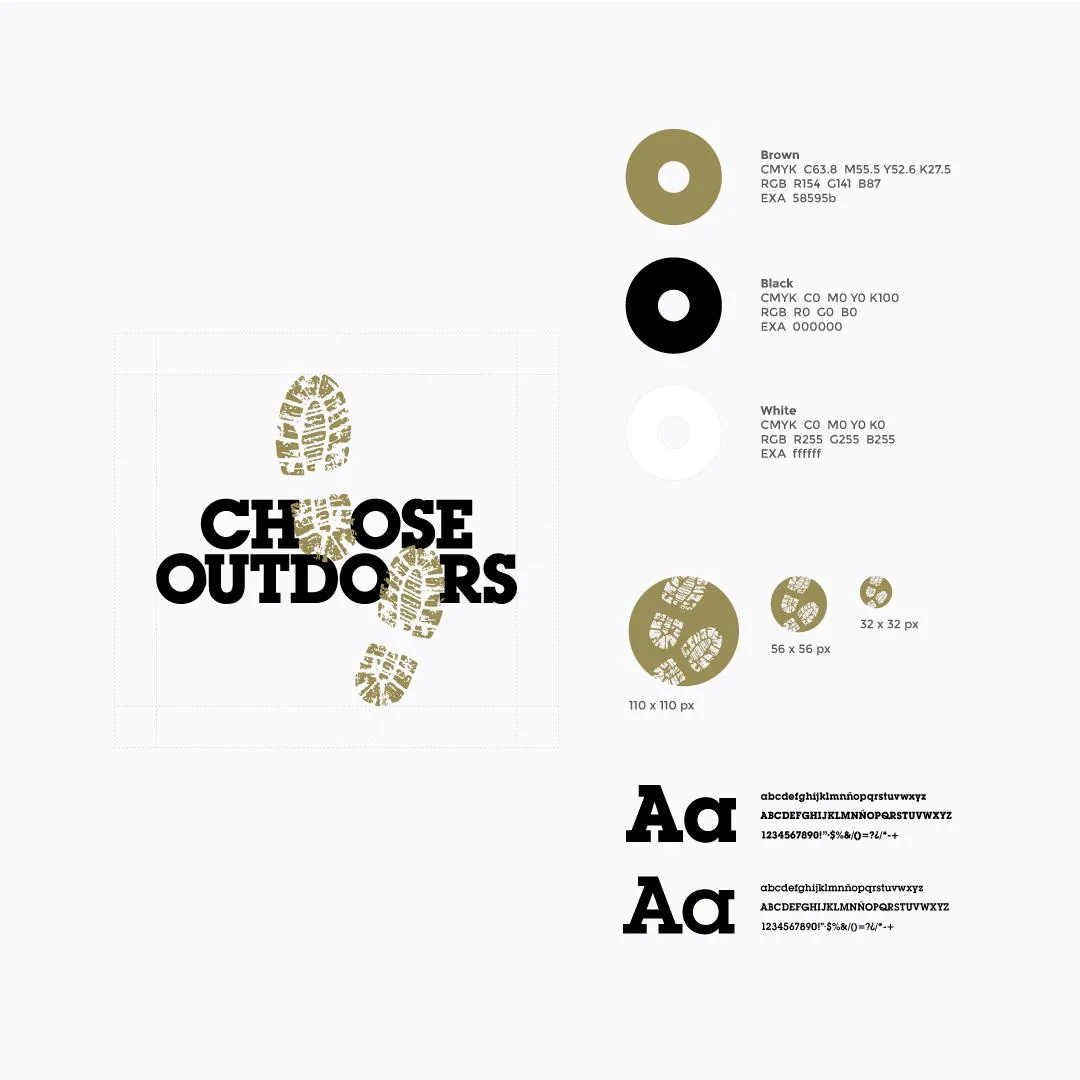
Everything a printer or a developer needs. Construction grid and clear space, three colours in CMYK, RGB and HEX, favicon crops at 110, 56 and 32 pixels, and both type weights specimen'd. Hand it to anyone and the brand comes out the same.
Out in the world
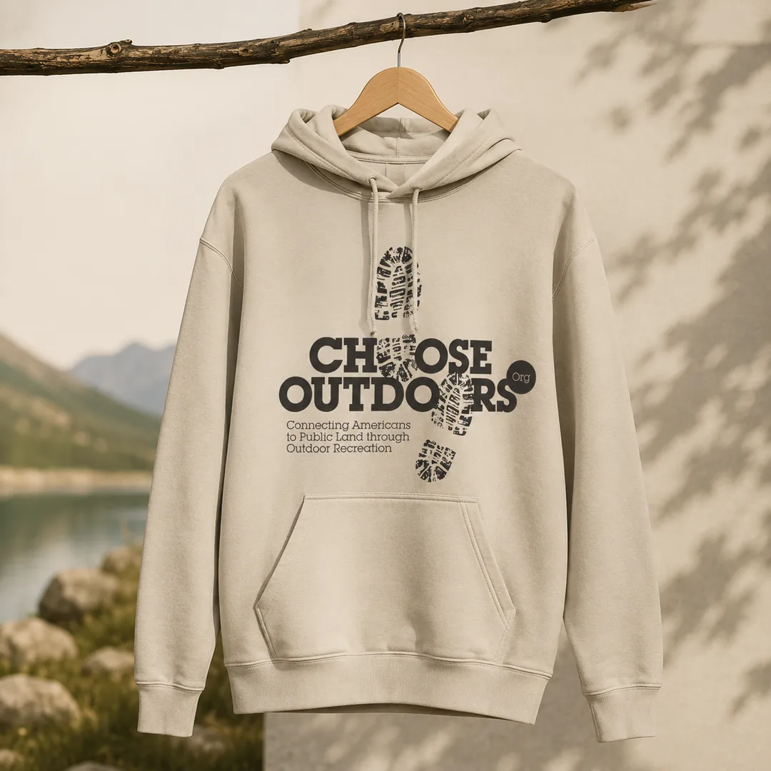
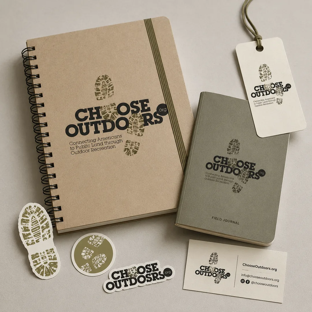
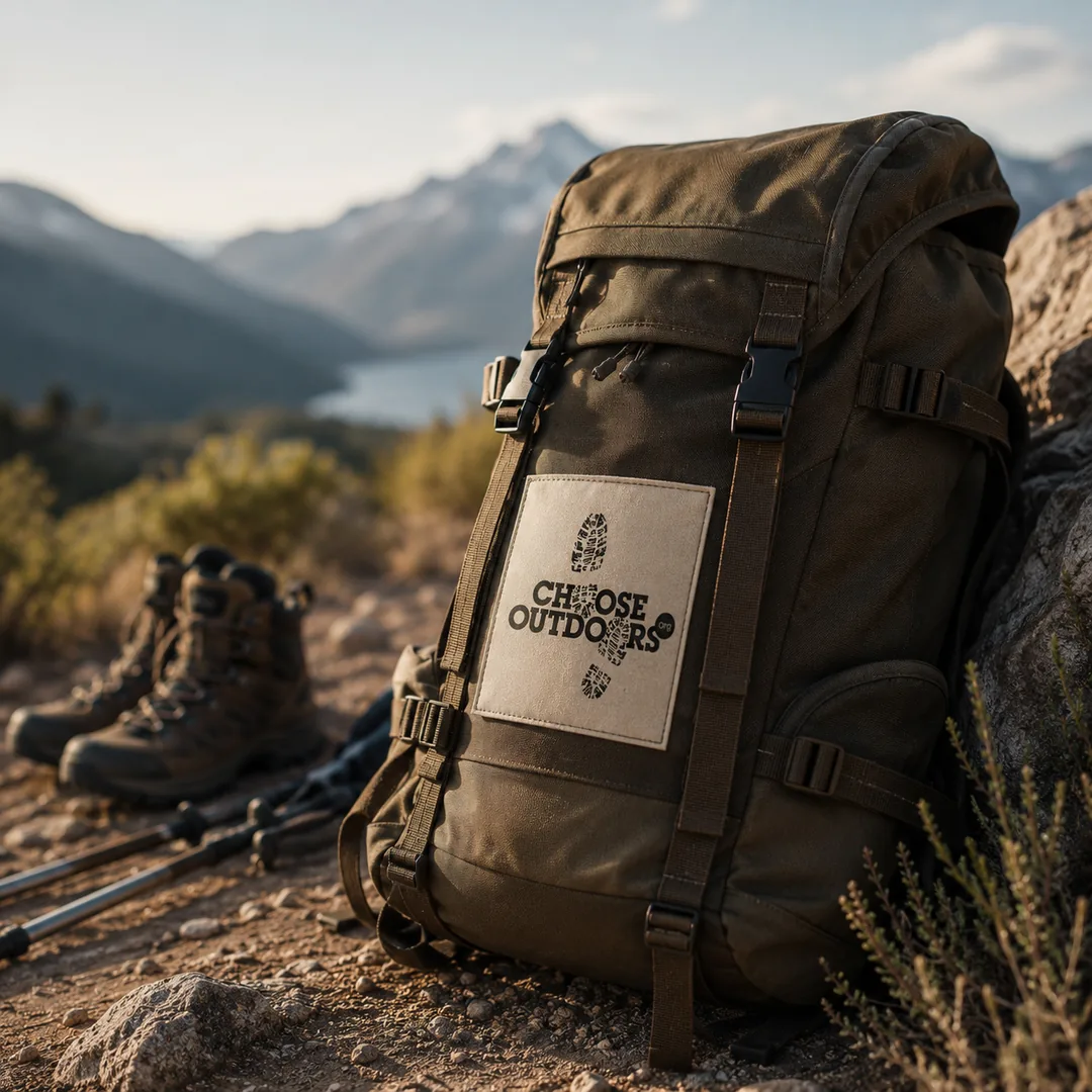
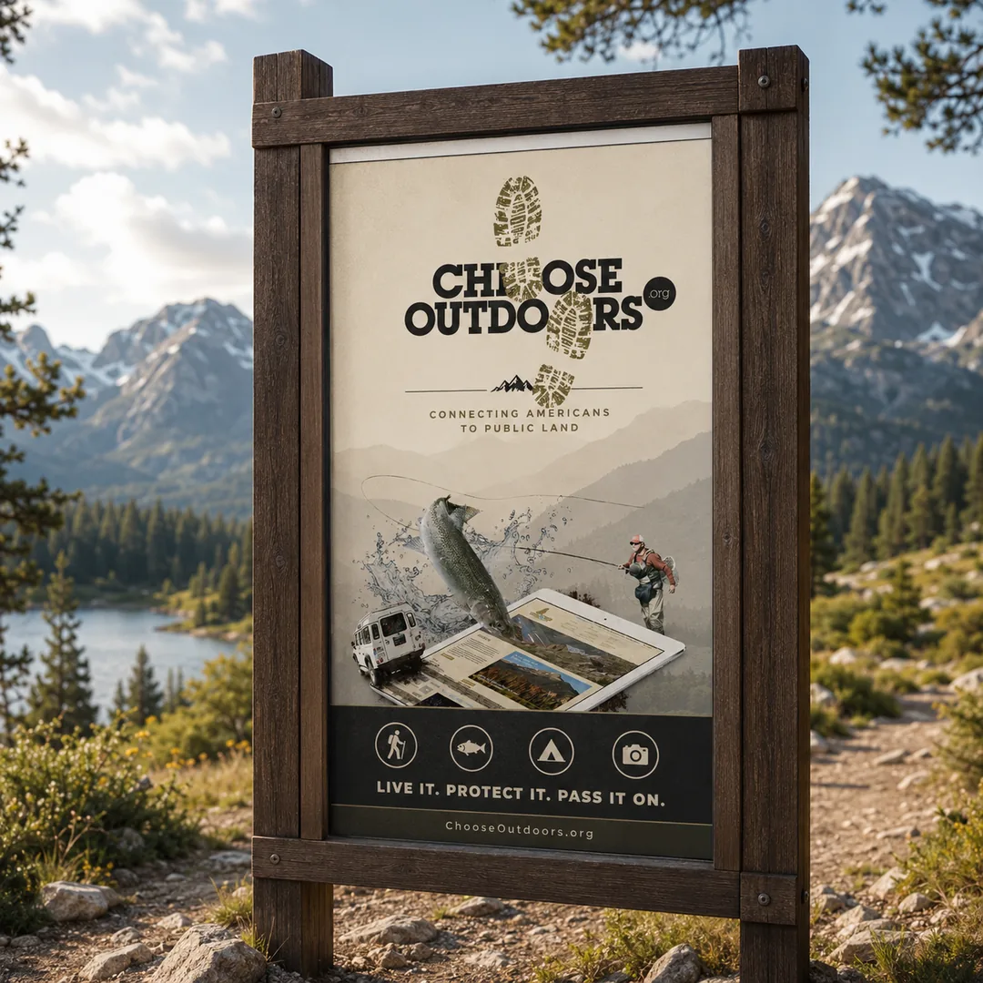
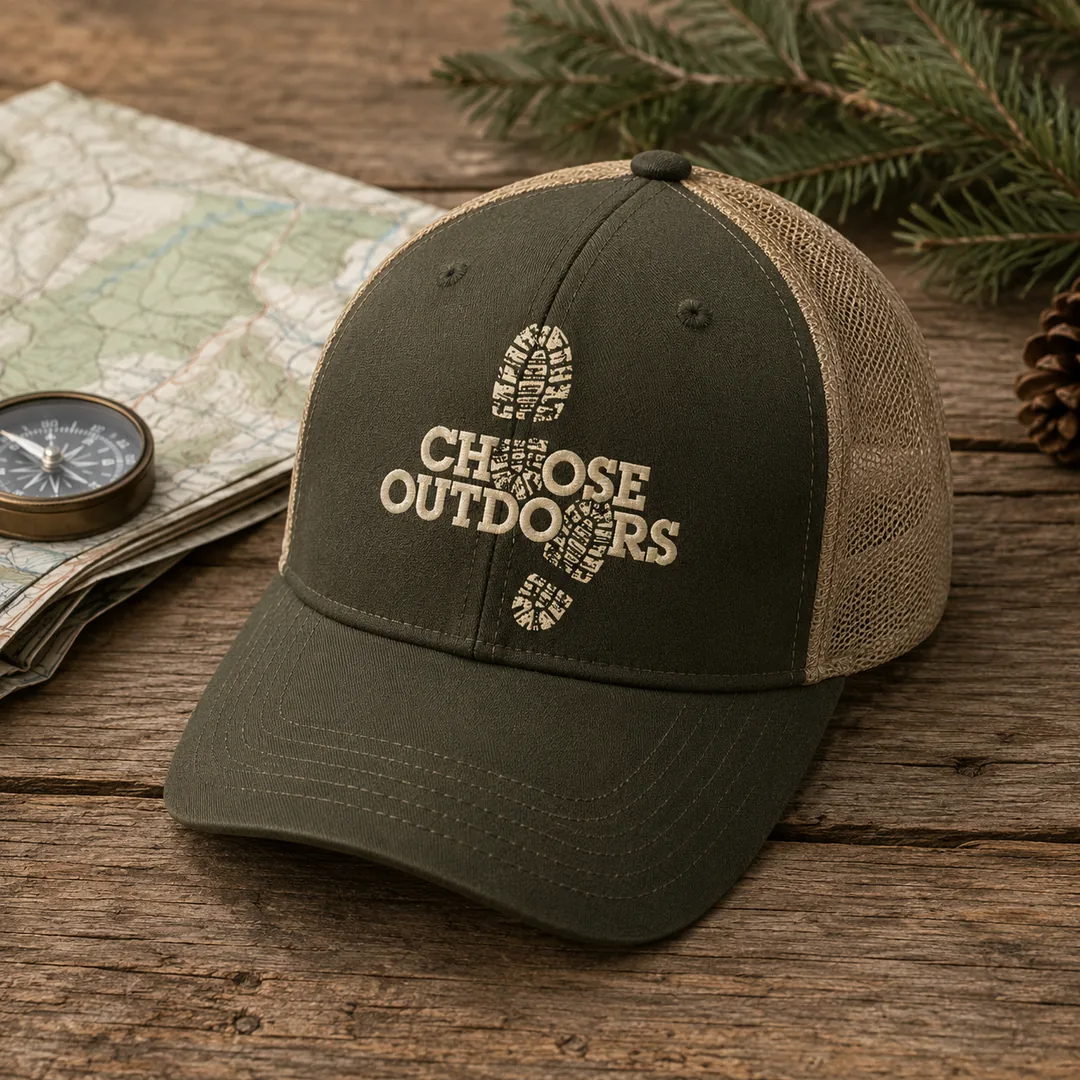
Where people meet it.
The outcome
Welcoming, by design.
Choose Outdoors now has a cohesive identity and a website built to invite people in, carrying one warm, consistent brand from first impression to the moment someone decides to get involved.
Your brand could be next.
Tell us what you are growing and we will show you exactly where to start, free and with no obligation.