Earthshot Climate Action
A new mark, a new site and a shop, for the nonprofit taking climate action into Fortnite.
The context
Stop selling fear. Sell the future.
Earthshot™ is a nonprofit built on a simple observation: traditional climate messaging is not working. A slice of the public still is not convinced, and most of the rest feel overwhelmed and hopeless. Fear and urgency do not drive change, so Earthshot stopped talking about climate perils and started showing off what clean technology can already do.
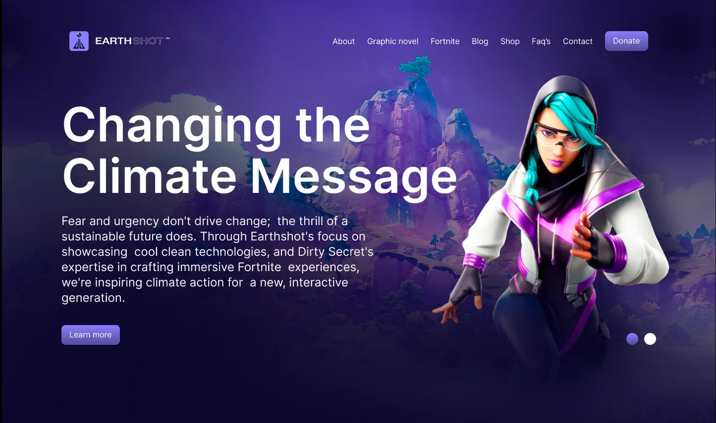
Their audience is young, online and hard to reach with a donation banner: gamers, students, people who found the cause through a Fortnite island or a graphic novel. The brand and the website had to match that energy, and they had to sell things too. We have been the team behind both for over a year.
The work
One mark, one site, one shop.
We started with the logo. The original mark was a photographic composition, a chrome monument under a starfield, beautiful at poster size and unusable everywhere else: it fell apart as a favicon, on a dark navigation bar, on merch. We took the shape they were attached to and rebuilt it as a flat geometric mark that survives at any size, then paired it with a clean wordmark.
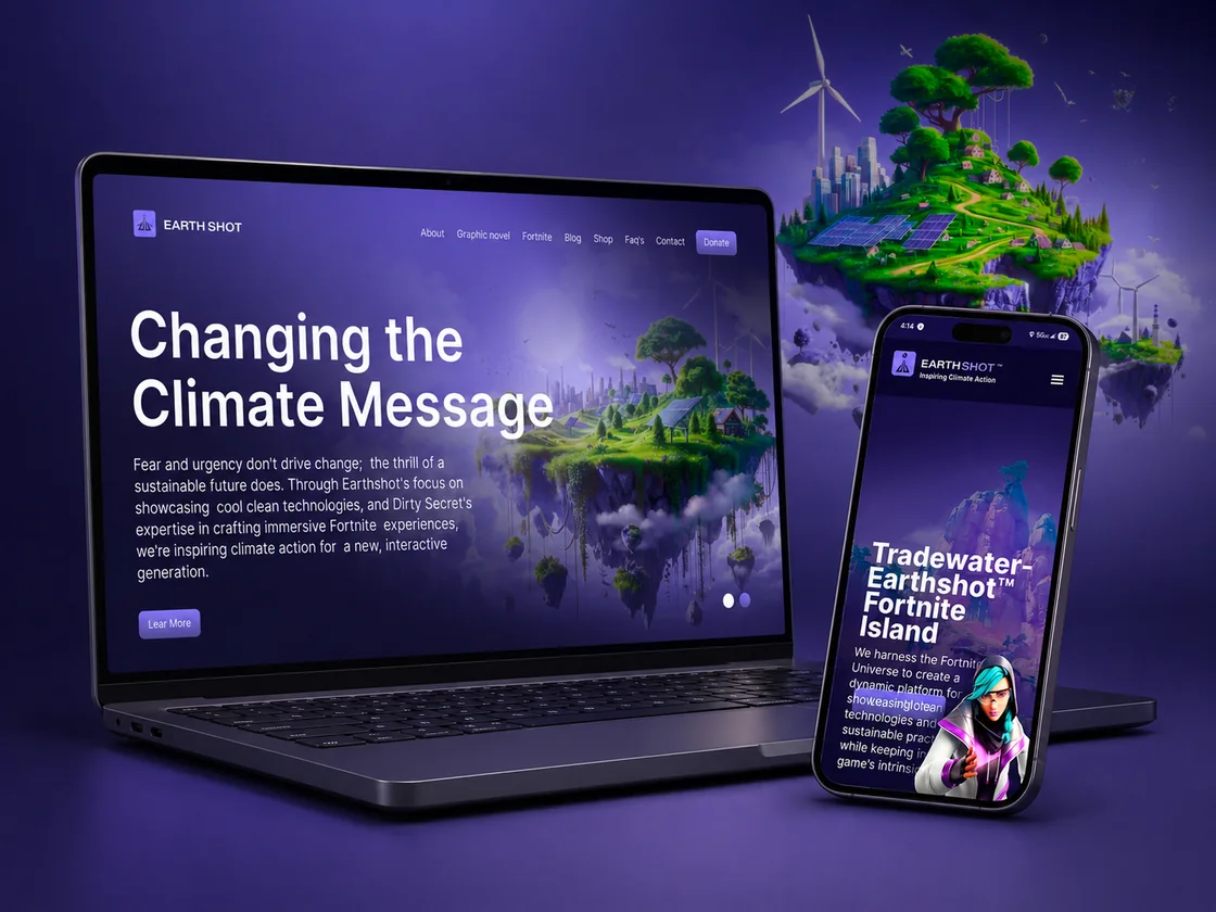
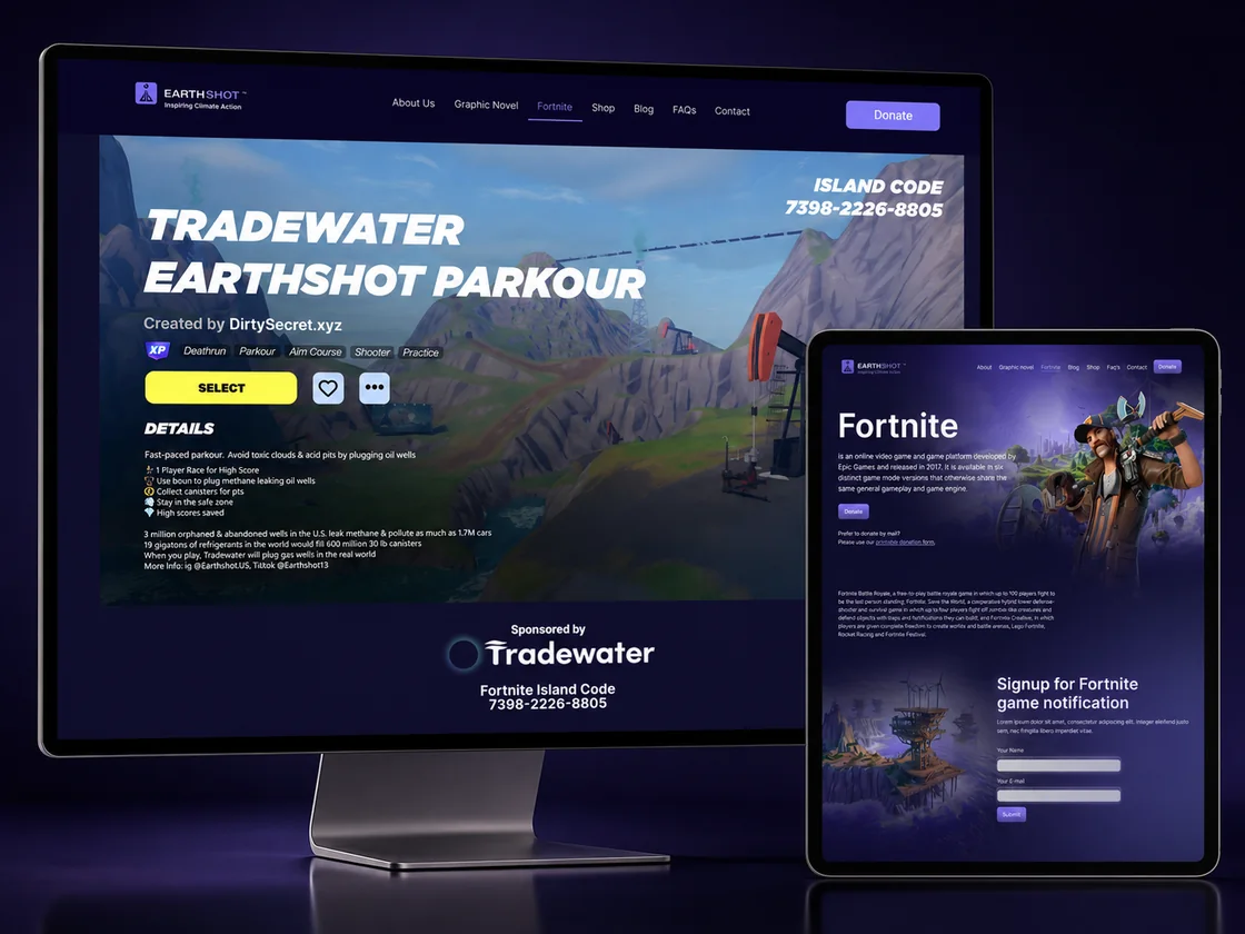
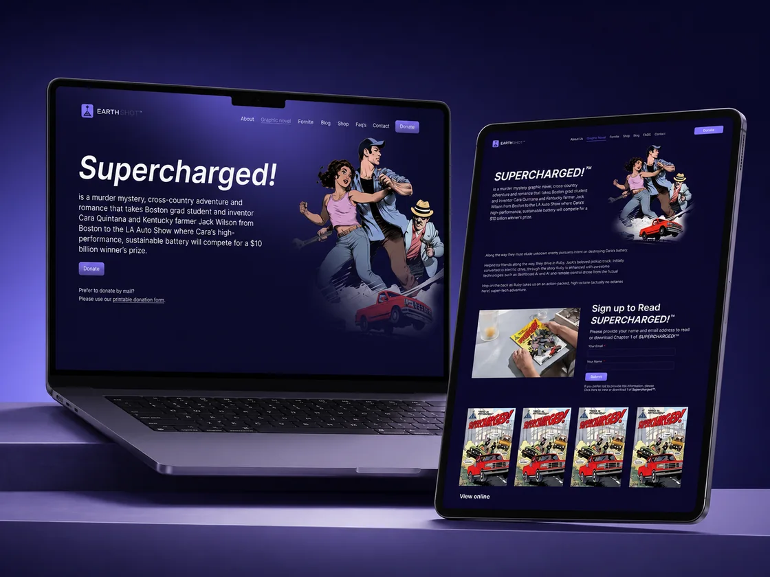
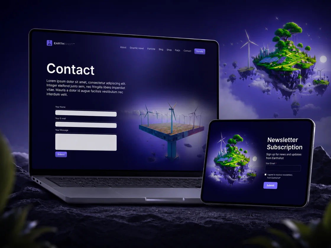
From there we planned and built the new earthshot.us on WordPress, mobile first: personas, wireframes, site maps and flowcharts, then UX/UI design, development, SEO and testing. The site carries the whole universe in one place, the Tradewater–Earthshot Fortnite island, the SUPERCHARGED!™ graphic novel, the blog and the donation paths.
We also added the shop, so the graphic novel and the merchandise sell directly from the site instead of living as a link somewhere else. And we did not hand over the keys and leave: Planet Media has kept the site running, updated and evolving for more than a year.
The mark
From a poster to a logo.
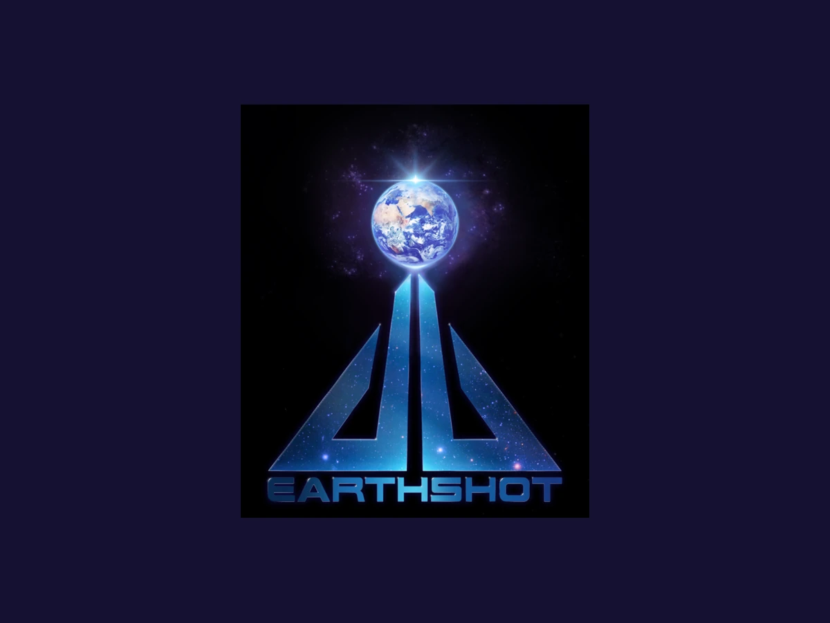
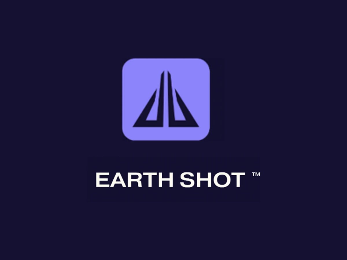
Same idea, built to survive. The team was attached to the original silhouette, so we kept it and rebuilt it flat: no photographic texture, no gradients that muddy at 32 pixels. It now works as a favicon, on a dark header and printed on merch.
The site
Every part of the universe.
The outcome
A brand that works at any size.
Earthshot now has a mark that reads on an app icon and on a t-shirt, and a site that showcases the Fortnite island and the graphic novel while driving traffic, growing the newsletter, opening the door to corporate and private donors and selling merch. It was built to reach youth and gamers on their own turf, and it is still being looked after every month.
Your brand could be next.
Tell us what you are growing and we will show you exactly where to start, free and with no obligation.